Medical Dashboard Redesign: Shifting from High Cognitive Load to High Conversion
I led a comprehensive UX audit and information architecture overhaul for a Bulgarian health app, converting a chaotic, in-house interface into an understandable patient dashboard while bypassing expensive medical device licensing fees.
What I Did
-
Patient Journey & Mental Model Audit: Evaluated the complete user lifecycle—from first landing, to manually inputting blood pressure and glucose data, to syncing wearables—revealing that the old design met only 10% of patient expectations.
-
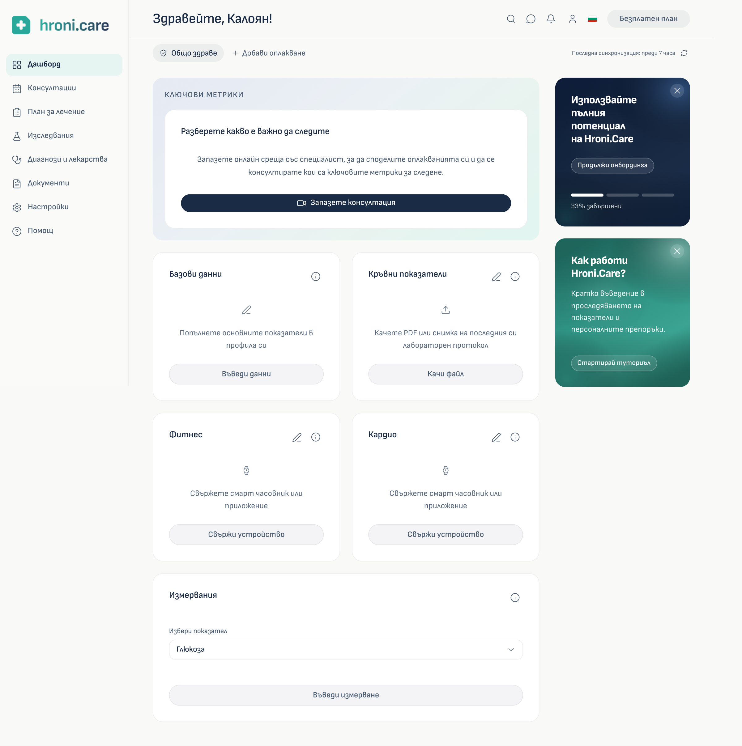
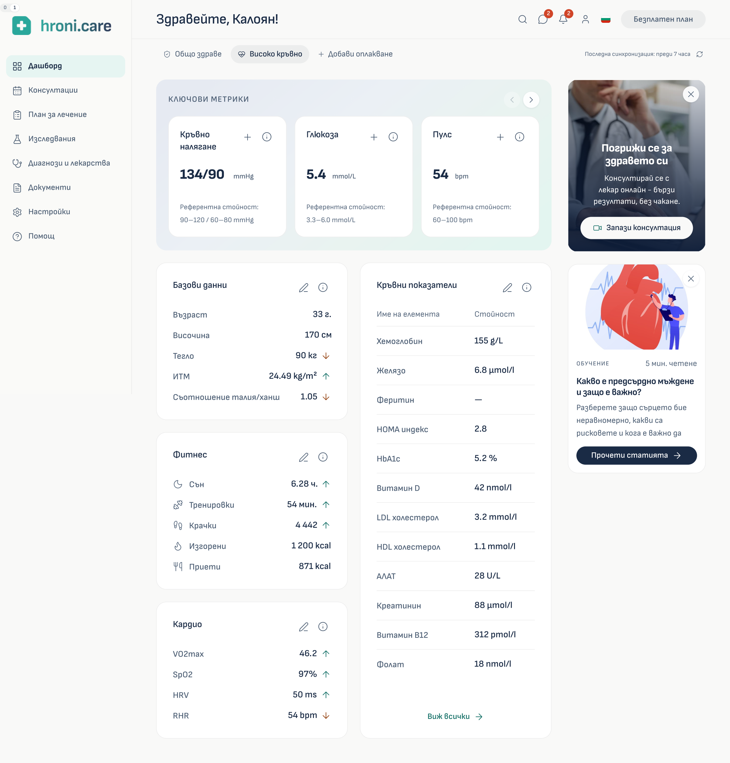
Bird's-Eye Information Architecture: Cleaned up the data chaos by grouping scattered medical metrics into clear, expandable summary cards, allowing patients to easily drill deeper on demand.
-
Figma & Code Prototyping: Consolidated fragmented elements into reliable components and used Cursor to code a live, clickable prototype to show the client real-time user lifecycle states.
Challenges & Iterations
-
Bypassing Expensive Diagnostic Licensing: Showing direct diagnostics with a red-yellow-green "traffic light" scheme required massive licensing fees. I bypassed this by designing a subtle benchmarking system using clear reference ranges inside tooltips, keeping data actionable without legal or financial risks.
-
Fixing Dashboard Access & Cognitive Overload: The legacy app buried the dashboard and forced global site navigation and dense clinical data onto one screen. I rebuilt the entry pathways to isolate the workspace, eliminate the heavy cognitive load, and focus on a single primary goal: "Book Consultation".
-
Translating Clinical Jargon & Enhancing Accessibility: The old layout featured confusing chemical abbreviations (like HbA1c) and scored a failing 64% accessibility rating. I added plain-language tooltips to demystify medical terms and boosted text contrast to reach 91% AA WCAG compliance using semantic HTML guidelines.